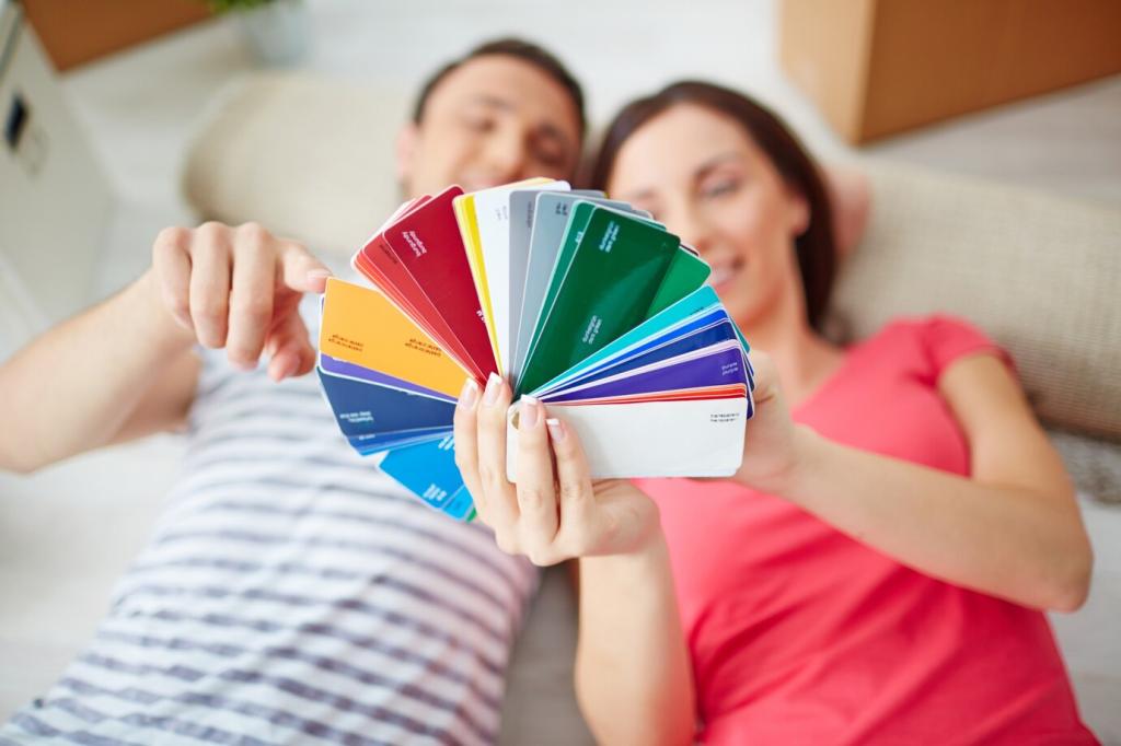
Harmonizing Hues: Complementary and Analogous Colors

Chosen theme: Harmonizing Hues: Complementary and Analogous Colors. Welcome to a color-forward home base where we explore bold contrasts and seamless flows, learn practical techniques, and swap inspiring stories. Subscribe and join the conversation as we turn theory into palettes that sing.

Complementary Pairs, Instant Contrast

Complementary colors sit opposite on the wheel—think blue and orange, red and green, purple and yellow. Their interaction heightens perceived brightness and clarity, useful for emphasis and focal points. Try desaturating one partner slightly for sophistication, then share your test palettes with us.

Analogous Neighbors, Seamless Flow

Analogous schemes draw from two to five adjacent hues, like blue, blue-green, and green. They produce continuity and gentle movement, perfect for backgrounds, layouts, and atmospheric scenes. Establish a dominant hue, a supportive neighbor, and a restrained accent, then tell us which range calms your eye most.

The 60–30–10 Balance

A practical starting ratio: 60 percent dominant hue, 30 percent secondary, 10 percent accent. With complements, reserve the accent for the opposite color. With analogous sets, let a neutral break monotony. Test this method in your next layout and comment with what you tweaked.
Place a color beside its complement and watch it intensify. This perceptual effect can make highlights shimmer and edges appear sharper. Use it to lift key data, calls to action, or brushwork details, then share a screenshot demonstrating the contrast you achieved.

Perception, Psychology, and the Stories Colors Tell

Warm analogous schemes—reds through oranges—feel social, lively, and inviting. Cool runs—blues through blue-greens—read calm, cerebral, and clear. Consider cultural cues and context, like seasonal associations, when choosing. Post your favorite three-hue progression and the mood you hoped to evoke.

Perception, Psychology, and the Stories Colors Tell

Branding with Bite and Warmth

A complementary accent can sharpen a logo’s silhouette and improve recognition at small sizes. Think blue wordmark with an orange mark or red glyph against a green field. I once guided a coffee roaster toward teal–orange; customer recall rose noticeably—share your boldest pairing.

Branding with Bite and Warmth

Analogous families excel across touchpoints: packaging tiers, section headers, and app surfaces. Keep typography and neutrals consistent while allowing neighboring hues to carry hierarchy. Post a three-tier palette where each tier feels distinct yet kin, and tell us why it works.

Interfaces that Click: UI with Complementary and Analogous Cues

Let your primary action use a vibrant hue and reserve its complement for critical moments like alerts or selection highlights. Keep content areas in restrained analogous tones to reduce fatigue. Try a neutral base plus one bold complementary accent, then report your click-through changes.

Interfaces that Click: UI with Complementary and Analogous Cues

Hover, focus, and pressed states benefit from tiny analogous shifts—lighten or rotate hue slightly to convey continuity without visual noise. Use the complementary accent sparingly for confirmations. Share a short screen capture where state changes feel intuitive, not jumpy.

Interfaces that Click: UI with Complementary and Analogous Cues

In dark mode, saturated complements can glow too aggressively. Test reduced saturation and increased luminance contrast for legibility. Let analogous backgrounds step between panels gracefully. Post your tokenized color set and how you tuned contrast across both themes.

Space and Lens: Interiors and Photography

Room Palettes that Breathe

Anchor walls with an analogous range for flow, then sprinkle complementary touches through textiles, plants, or art. Natural materials soften saturation and reflect light differently by time of day. Upload a room photo and we’ll weigh in on two complementary accent options.

Color Grading: Orange–Teal and Beyond

Classic orange–teal grading rides complementary temperature: warm skin tones against cool shadows. Explore green–magenta for product shots or blue–orange for landscapes. Keep midtones honest to avoid plastic results. Share a before–after where complements clarified your subject.

Chasing Analogous Light

Golden hour offers an analogous sweep from honey to coral; coastal mornings lean through powder blues. Train your eye to see transitions, then place a complementary accent—a scarf, sign, or umbrella—to anchor the scene. Subscribe for weekly field prompts.

Tools, Workflows, and Reliable Palettes

Use tools like Adobe Color, Coolors, or a physical Itten wheel to explore complements and neighboring spans. Start broad, then refine by adjusting brightness and saturation. Share your favorite generator settings and one unexpected pairing you discovered.

Tools, Workflows, and Reliable Palettes

Print or paint swatches, then evaluate under daylight, warm LEDs, and screens. What sings on a monitor may shout on paper. Keep notes on materials, lighting, and textures. Upload your test grid and we’ll suggest nuanced complementary tweaks.

Tools, Workflows, and Reliable Palettes

Name tokens clearly—brand-primary, brand-primary-comp, surface-analog-1—and store them in shared libraries. Document intended uses to prevent drift. When you iterate, keep changelogs. Subscribe to get our template for palette version control.

Tools, Workflows, and Reliable Palettes

Lorem ipsum dolor sit amet, consectetur adipiscing elit. Ut elit tellus, luctus nec ullamcorper mattis, pulvinar dapibus leo.

Centreofprofessionallearning
Privacy Overview

This website uses cookies so that we can provide you with the best user experience possible. Cookie information is stored in your browser and performs functions such as recognising you when you return to our website and helping our team to understand which sections of the website you find most interesting and useful.