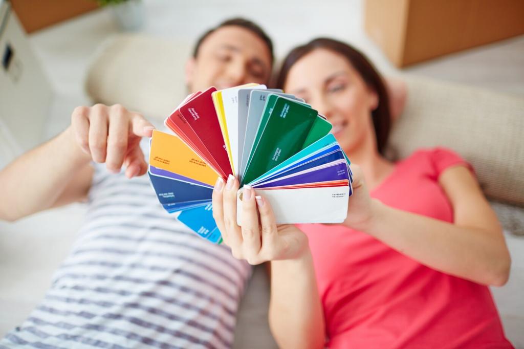
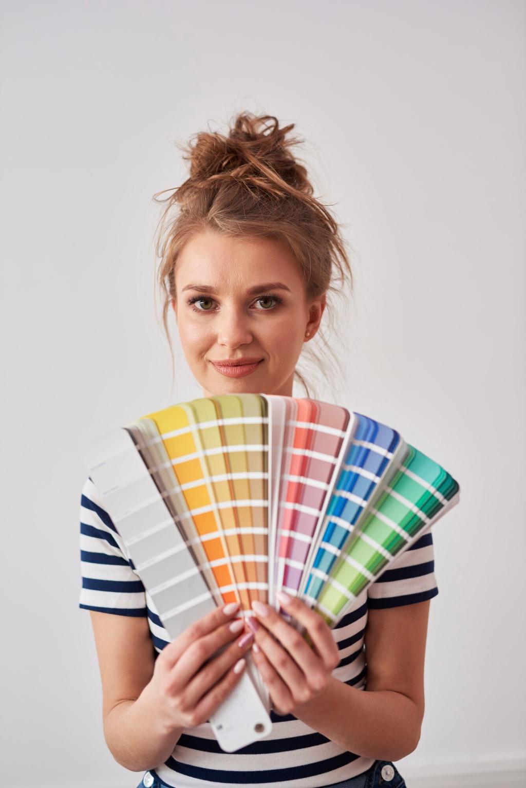
Color Wheel Essentials for Artists: Turn Uncertain Palettes into Confident Paintings
Chosen theme: Color Wheel Essentials for Artists. Welcome to a warm, practical journey through color decisions that feel natural, expressive, and brave. We will translate theory into studio habits, share stories from the easel, and invite you to experiment. If color sometimes intimidates you, stay awhile—subscribe for weekly palette challenges, thoughtful exercises, and friendly feedback that will grow your eye.
In the studio we often use RYB primaries—red, yellow, blue—not because they are perfect, but because they are practical. Each paint carries bias. A warm red leans yellow, a cool red leans blue. Noticing bias accelerates clean mixes.
02
Mix primaries to find secondaries, then mix a primary with a neighboring secondary to discover tertiaries. These bridge colors are where subtlety lives—olive greens, blue-violets, red-oranges. Keep a swatch journal to map them intentionally over time.
03
Newton spun light into a spectrum, Johannes Itten styled it into teachable wheels, and we adapt it for paint, pixels, and print. The wheel is a lens, not dogma. Use it to plan mood, contrast, and visual rhythm before the first stroke.
Finding complements quickly
Opposites attract: red–green, blue–orange, yellow–violet. When in doubt, rotate the wheel and stop across your chosen hue. Test small swatches side by side and squint. The right opposite will vibrate, then settle into purposeful contrast.
Neutralizing with intention
Mixing complements nudges chroma down to elegant grays and browns. Portrait painters often mute green with a touch of red to calm skin tones. Think of complements as volume knobs, letting you dial drama up or down without dulling values.
A quick studio anecdote
I once overworked a sunset until it squeaked. A tiny stroke of blue in the orange sky quieted the glare and made the warm glow believable. Complements can rescue loud passages by lending balance without repainting entire sections.
Analogous and Monochromatic Harmony
01
Analogous: neighbors that sing softly
Pick a home hue and invite its neighbors. Blue, blue-green, and green feel related, like instruments in one section of an orchestra. Vary value and temperature within the family to avoid monotony while preserving a seamless atmosphere.
02
Monochrome: depth within one hue
Choose a single hue and explore tints, shades, and tones by adding white, black, or gray. It is a masterclass in value control. With restrained color, composition, edges, and light suddenly carry the emotional weight, beautifully.
03
A practical harmony exercise
Set a timer for twenty minutes. Paint a small scene using only three analogous colors plus white. Push edges soft and hard. Share your results and note how limited choices accelerated decisions rather than limiting expression.
Pairing warms and cools for lively mixes
Mix a warm yellow with a cool blue for crisp greens; swap either temperature and the result shifts dramatically. Record these changes in a chart. Temperature is relative, so always compare swatches side by side under your studio light.
Outdoor sunlight often reads warm, casting cooler shadows. Overcast days flip the script. Observe first, then confirm on the wheel. Let temperature shifts carry form across a cheekbone or hillside without piling on heavy, distracting details.
Value, Saturation, and the Wheel’s Hidden Dimensions
Value first, color second
Convert your reference to grayscale, or squint at your subject. If values hold, the painting reads at a glance. Place the largest value shapes early, then layer color decisions on top so hues support, not sabotage, the composition.
Limit saturation broadly, then reserve a vivid accent near the focal point. A single high-chroma stroke can feel like a spotlight in a quiet theater. Complements and grays are your dimmers, guiding attention without shouting.
Tints add white, shades add black, tones add gray. Each path shifts mood differently. Keep a small mixing card with examples for your favorite hues so you can predict how the emotional temperature changes as chroma and value move.
From Studio to Screen: Applying the Wheel in Digital and Traditional Media
Use HSL sliders to explore hue shifts while holding value steady, then switch to LAB for perceptual tweaks. Build palettes with intentional saturation ramps. Export swatches and test on multiple screens to confirm relationships remain convincing.
From Studio to Screen: Applying the Wheel in Digital and Traditional Media
CMYK narrows gamut, so preview early. That electric blue may need a neighboring accent to feel alive in print. Convert with soft proofing, then adjust saturation and value to preserve the intended focal path across the final layout.