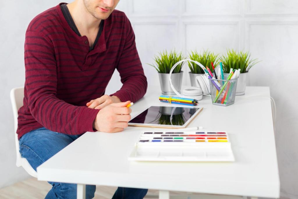
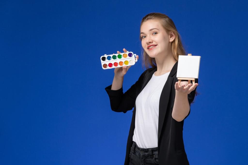
Color Theory in Digital vs. Traditional Art
Chosen theme: Color Theory in Digital vs. Traditional Art. Step into a vivid conversation where glowing pixels and tactile pigments meet, compare notes, and inspire bolder choices. Explore practical techniques, creative stories, and actionable workflows—and join the discussion by commenting, subscribing, and sharing your color experiments with our community.
Additive Light vs. Subtractive Pigment: The Core Split
Digital color adds light—red, green, and blue photons stack to create brightness and hue, with white as the sum. Traditional color subtracts—pigments filter light, lowering luminance as you mix, with muddy neutrals an ever-present risk. Recognizing this physics helps you predict results, reduce surprises, and design intentional color harmonies.
Additive Light vs. Subtractive Pigment: The Core Split
A color that pops on a tablet can die on canvas because layered pigments dim light and reduce saturation. Conversely, pigment combinations that yield rich, nuanced neutrals may look flat when blindly translated to RGB. To avoid disappointment, test small swatches, compare under varied lighting, and keep notes for future consistency.
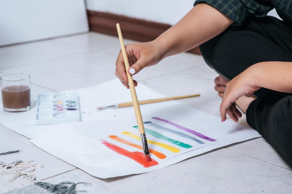
Additive Light vs. Subtractive Pigment: The Core Split
Paint a simple gradient digitally and traditionally, then match both by eye, focusing on value first and chroma second. Repeat with complements, deliberately pushing toward gray. Document your brush settings, pigment names, and ambient light. Sharing your results in the comments helps others see where perception diverges across mediums.
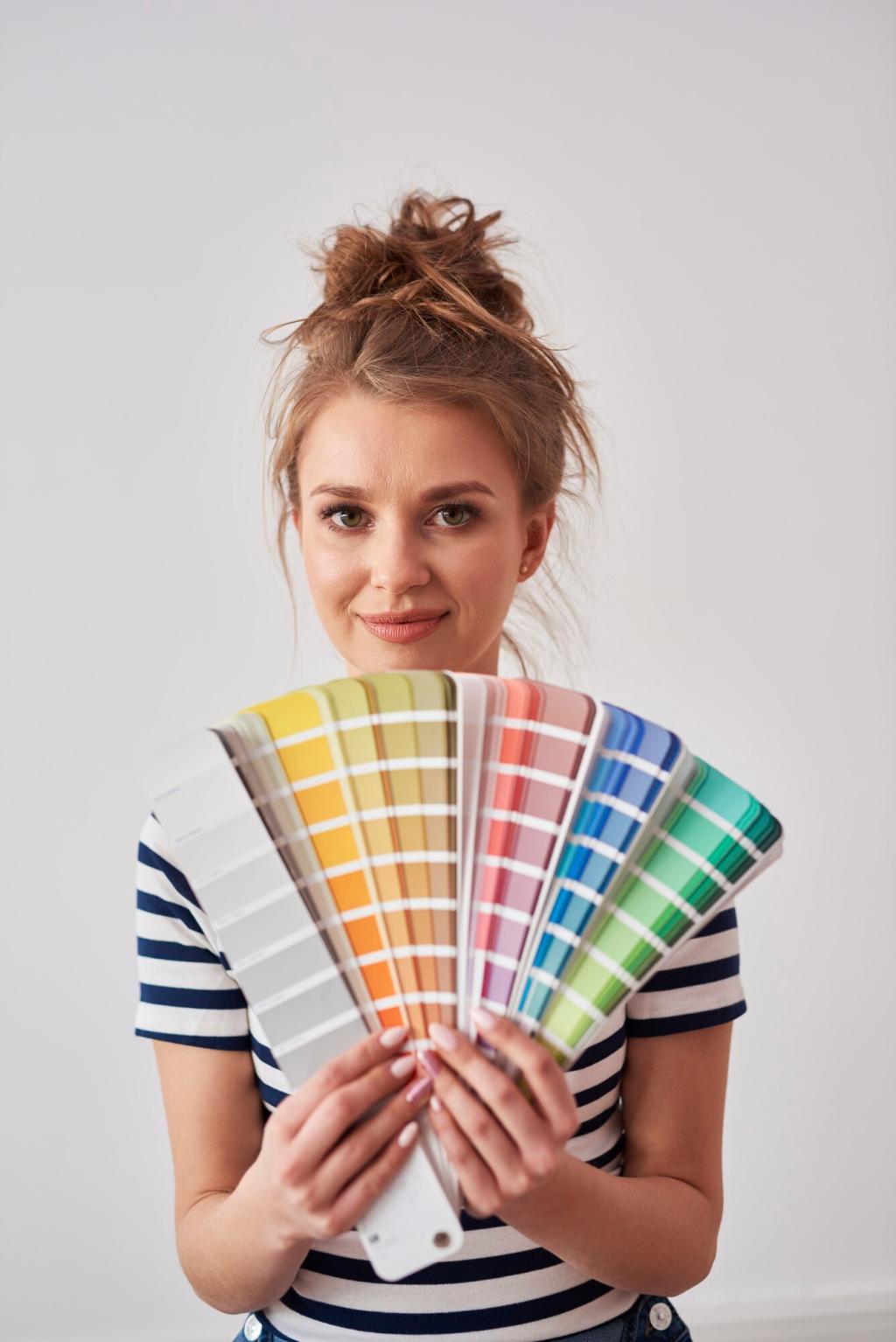
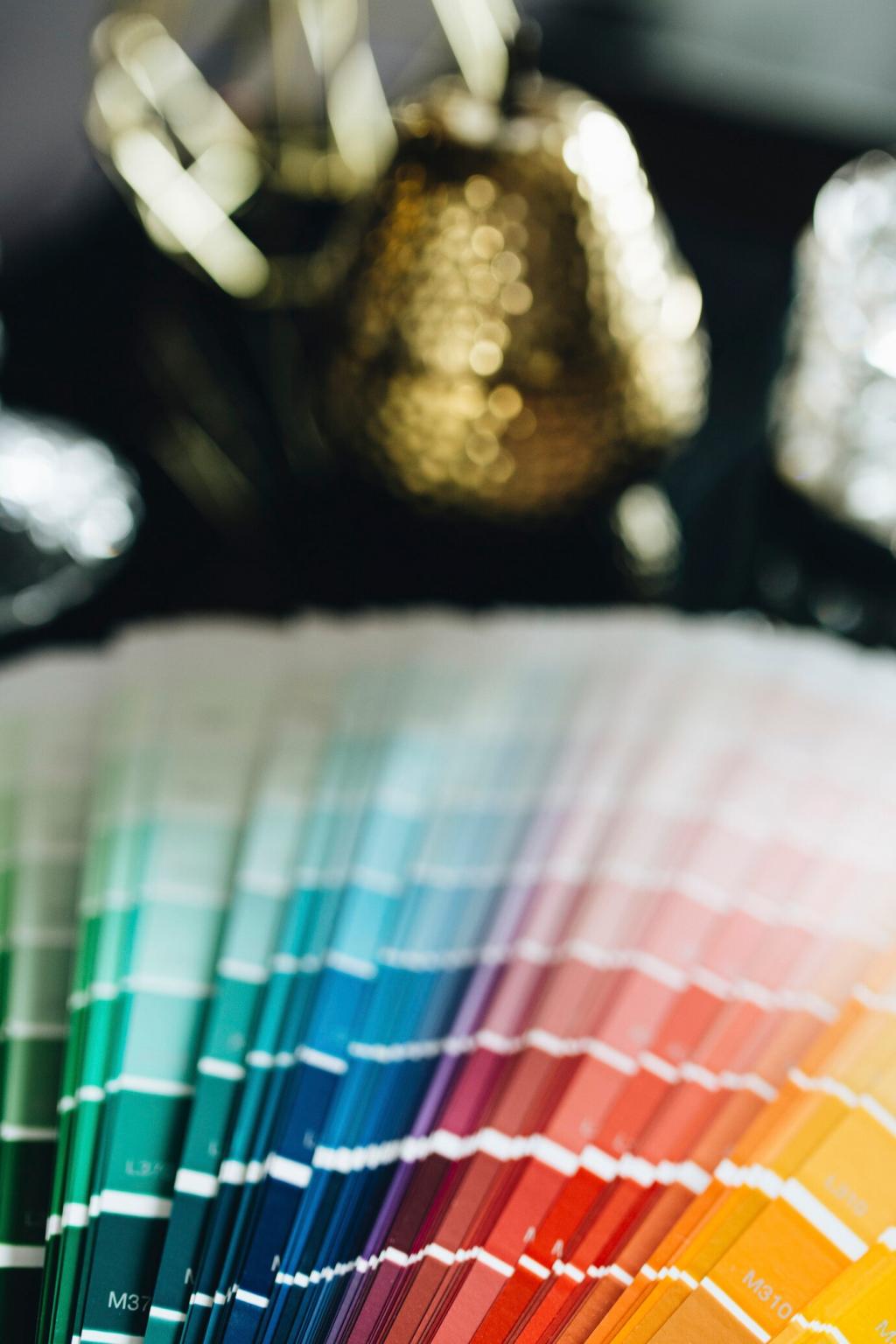
Gamut and Color Spaces vs. Real Pigments
For digital work destined for the web, sRGB keeps expectations realistic across devices. For print-focused work with professional labs, Adobe RGB or ProPhoto can protect saturated greens and cyans. Whatever you choose, lock it in from the start, calibrate your monitor, and embed your profile to preserve intent.
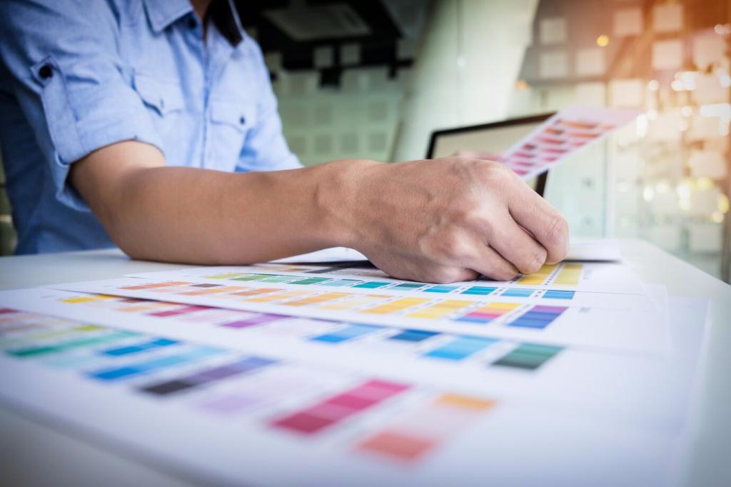
Gamut and Color Spaces vs. Real Pigments
Use soft proofing with the correct ICC profile to preview out-of-gamut areas before printing. Adjust saturation and selective contrast, not just global hue, to maintain impact. Some colors simply cannot exist in certain media; compromise consciously, prioritize focal points, and annotate your adjustments for repeatable, stress-free results.
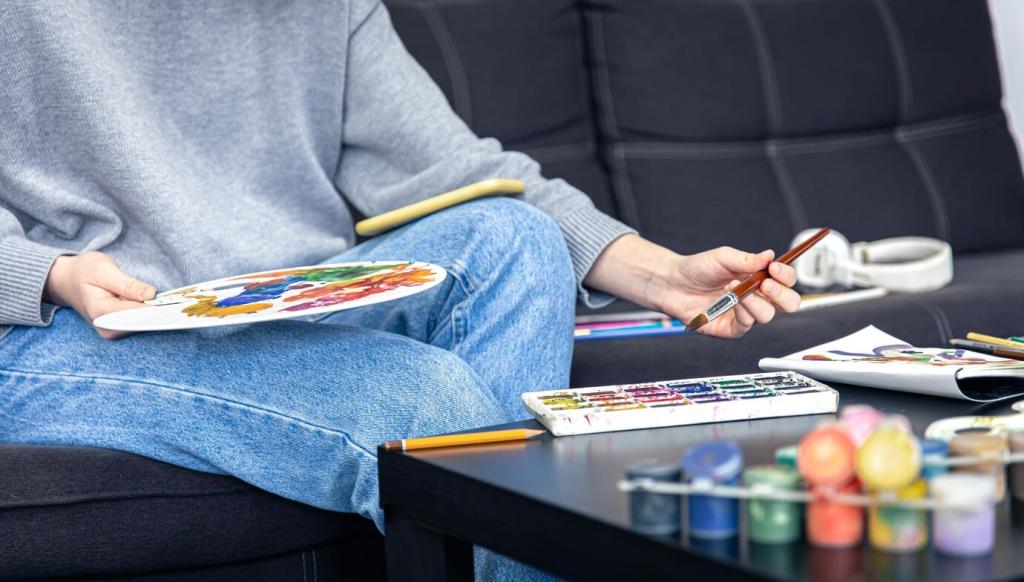
Blending, Glazing, and the Magic of Layers
Multiply darkens like layered transparent pigment; Screen brightens like light passing through a glaze; Overlay increases contrast, echoing selective scumbling. Keep brush flow low to stack subtle changes, and avoid over-saturation with adjustment layers. Share your favorite blend-mode recipes for skin tones, metals, and skies.
Blending, Glazing, and the Magic of Layers
Oils enhance depth through refractive index; acrylics dry slightly darker and cooler; watercolor shifts lighter as water evaporates. Each medium alters value and chroma unpredictably at first. Track dry-down shifts with a swatch chart and photograph stages to compare; your future self will thank you during complex passages.
Light, Environment, and Calibration: Seeing True Color
Use a hardware calibrator monthly, target D65, gamma 2.2, and an appropriate luminance for your studio lighting. Avoid overly bright screens that make prints look too dark. Once calibrated, keep a neutral desktop background, disable night mode while working, and embed profiles to prevent surprise shifts when sharing.

Light, Environment, and Calibration: Seeing True Color
Aim for 5000K to 5500K lighting with high CRI (95+) and neutral walls to reduce color cast. Position lights at angles that minimize glare on varnished surfaces. For consistency, photograph a gray card before sessions and compare daily; you will quickly notice seasonal daylight shifts that alter perceived color.
Surface and Texture: How Grounds Shape Color
The secret power of toned grounds
A mid-value ground helps judge extremes accurately, reduces the shock of bright white, and speeds block-in decisions. Warm grounds push cool complements to sparkle, while cool grounds make warm accents glow. Try a split-ground experiment and share which pairings made your subject feel most alive under natural light.
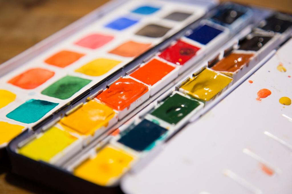
Paper, sizing, and watercolor’s drying shift
Cotton papers with proper sizing keep washes luminous, while overly absorbent sheets dull glazes. Expect watercolor to dry lighter; plan values accordingly, especially in skies and skin. Record pigments that granulate beautifully on textured paper and post examples—your discoveries can save someone else hours of testing.
Digital texture, noise, and realistic color breakup
Add subtle noise or texture layers to prevent sterile gradients and enhance perceived richness. Use low-opacity speckled brushes to mimic pigment clustering and edge variation. Calibrate your effect at 100% zoom, then step back. Comment with your go-to texture packs and how they affect temperature and saturation control.
Harmony, Contrast, and Narrative Color Choices
01
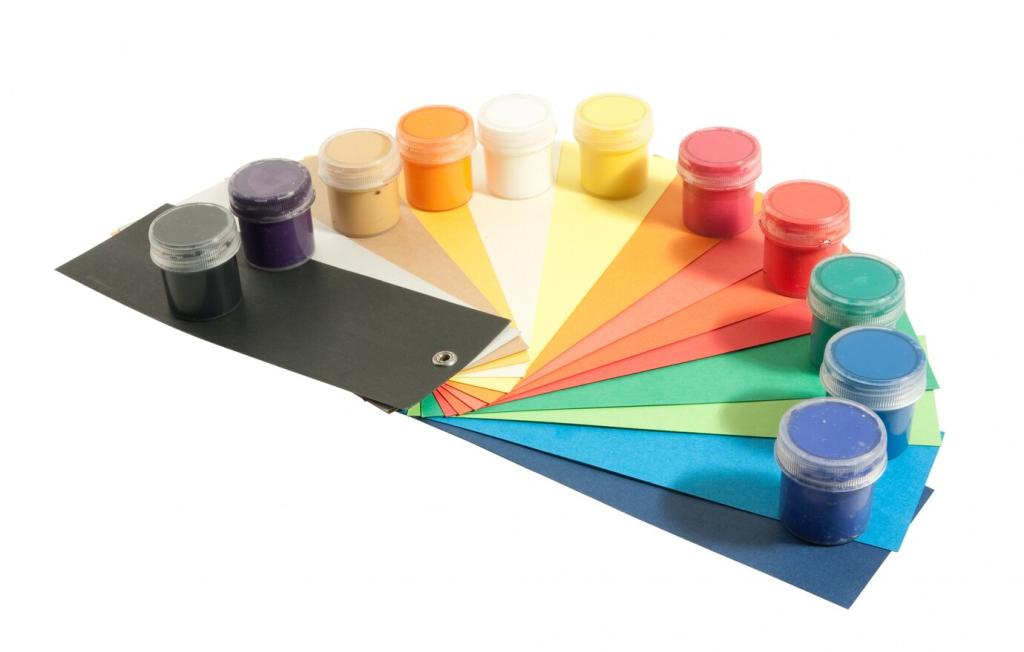
Limit your picker by establishing hue families and value bands before painting. Build a swatch library for key scenes and stick to it. Constraint breeds cohesion, eliminates decision fatigue, and lets you spotlight a single accent color for drama. Share screenshots of your swatch sets and why they work.
02
A Zorn-inspired palette forces clarity in value and temperature, producing believable skin with minimal hues. Complement-based palettes energize landscapes without garish saturation. Pre-mix strings to speed decisions, and glaze to refine. Post your favorite limited trio or quartet, plus a quick note on where it excels.
03
Warm highlights against cool shadows create direction and depth, whether in digital portraits or oil studies. Control saturation around focal points and let edges breathe elsewhere. Try a warm-over-cool strategy in one piece and the reverse in another, then tell us which narrative felt stronger and why.
A calm workflow for predictable prints
Soft proof with the printer’s ICC profile, adjust selectively to protect focal colors, and export with embedded profiles. Choose papers that suit your intent—matte for gentle diffusion, glossy for punch. Keep a print journal with settings and outcomes, then share your best combinations to help others avoid reprints.
Photographing paintings without nasty color casts
Use diffused daylight or balanced LEDs, triangulate lights to reduce glare, and shoot perpendicular to the surface. Include a color checker and gray card in frame, then correct in post before cropping. Post before-and-after shots in the comments along with your setup diagram so others can replicate success.
Varnish choices and how they shift color
Gloss varnish deepens darks and saturates color, while matte reduces glare but can lift values slightly. Test on a corner or a sample board first. Share which brands preserved temperature relationships best in your experience, and whether retouch varnish helped you evaluate color mid-process.
A Story About Color Courage
During a small workshop, a painter brought a muddied nocturne. We recreated the scene digitally, sampling values and testing cooler shadows against warm windows. Back at the easel, a single transparent warm glaze revived the glow. Share that one lesson you keep returning to when a piece feels lost.
A Story About Color Courage
A quick Overlay layer mapped where chroma had collapsed. With that guide beside the canvas, restrained complements and a touch of opaque highlight restored structure. Sometimes, crossing mediums clarifies intent. Tell us how a tablet mockup or a paint study saved a project you nearly abandoned in frustration.